
Chad’s Letterman Formatting Tips:
|
Enter Subtitle |
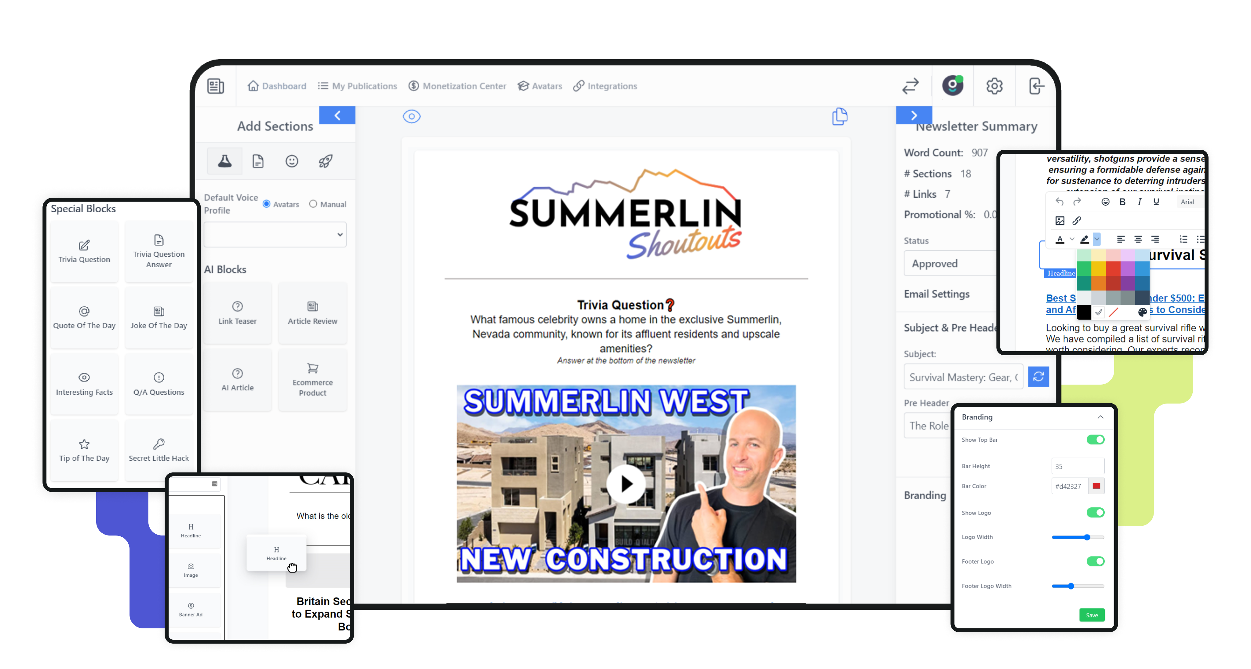
1. Consistent Color Branding on Registration and Archive Pages
"You wanna make sure that you are consistent with your colors, all right?"
2. Use a Horizontal, Rectangle Logo
"This logo here, you want it to be horizontal. You don't want it to be vertical, right? You want it to be long... You want it to be more lengthy, not so tall, right? That's why we've done that."
3. Add Links at the Bottom of Every Page
"I'm gonna say that 90% of people are not putting in their links at the bottom of their pages... Not just this page. But also if you go to the, uh, current issue, it should say current issue, not current issues. And if we go to the bottom here, it's the same thing."
4. Avoid Too Many Emojis in Subject Lines or Headers and the Body
"Nothing screams chat GPT and AI like emojis... Do you see them putting emojis in the subject line in the headers? You don't, I don't recommend you doing that."
5. Keep Subheadlines and Preheaders Short
"Sub headlines a little long. I would say I would do two here, right?... I'm seeing a lot of people that have like seven or eight lines here on your header. It's too much."
6. Turn On Author Name and Social Icons
"Does everybody know how to turn on your icons over here?... If you have these social profiles, they'll appear here... This name right here, this is another big thing, this name... If you come to publications and you edit your publication, there is an author name filled... Just go ahead and put your author name here, and that's what we'll pull in."
7. Use Background Colors and Buttons Sparingly
8. Be Careful with Spacing
"Be careful with spacing. I would say the biggest complaint that I've seen looking at everybody's newsletters is spacing... Remember, you have real human beings reading this, right?"
9. Pick Two Main Colors from Your Logo for Links
10. Add More Links to Boost Clicks
11. Use More Visuals, Less Text
Don’t make your newsletter too text-heavy. Add images and visual blocks to keep things interesting.
12. Use Bold and Icons Carefully
"Be careful with bold. We wanna emphasize Wednesday for bold and the rest, we don't wanna be bold at all, right?... Be careful with the icons. Be careful with spacing."
13. Archive and Registration Pages Can Pull in Archives
"You're gonna flip a switch and what you're gonna be able to do is you're gonna be able to bring your, your archives into your registration page too, right? "
Chad’s advice: Make your newsletter and pages look clean, colorful, and easy to read. Small changes make a big difference!
|
0 Comments
Join the conversation
Be the first to comment
Share your thoughts above.