What this guide is
People look for signs that others are here and getting value. We can show small, honest signals on a MintBird page so a visitor feels safe to act. This article explains the two widgets, where to place them, how often to show them, and the exact copy you can use.
Two simple widgets
-
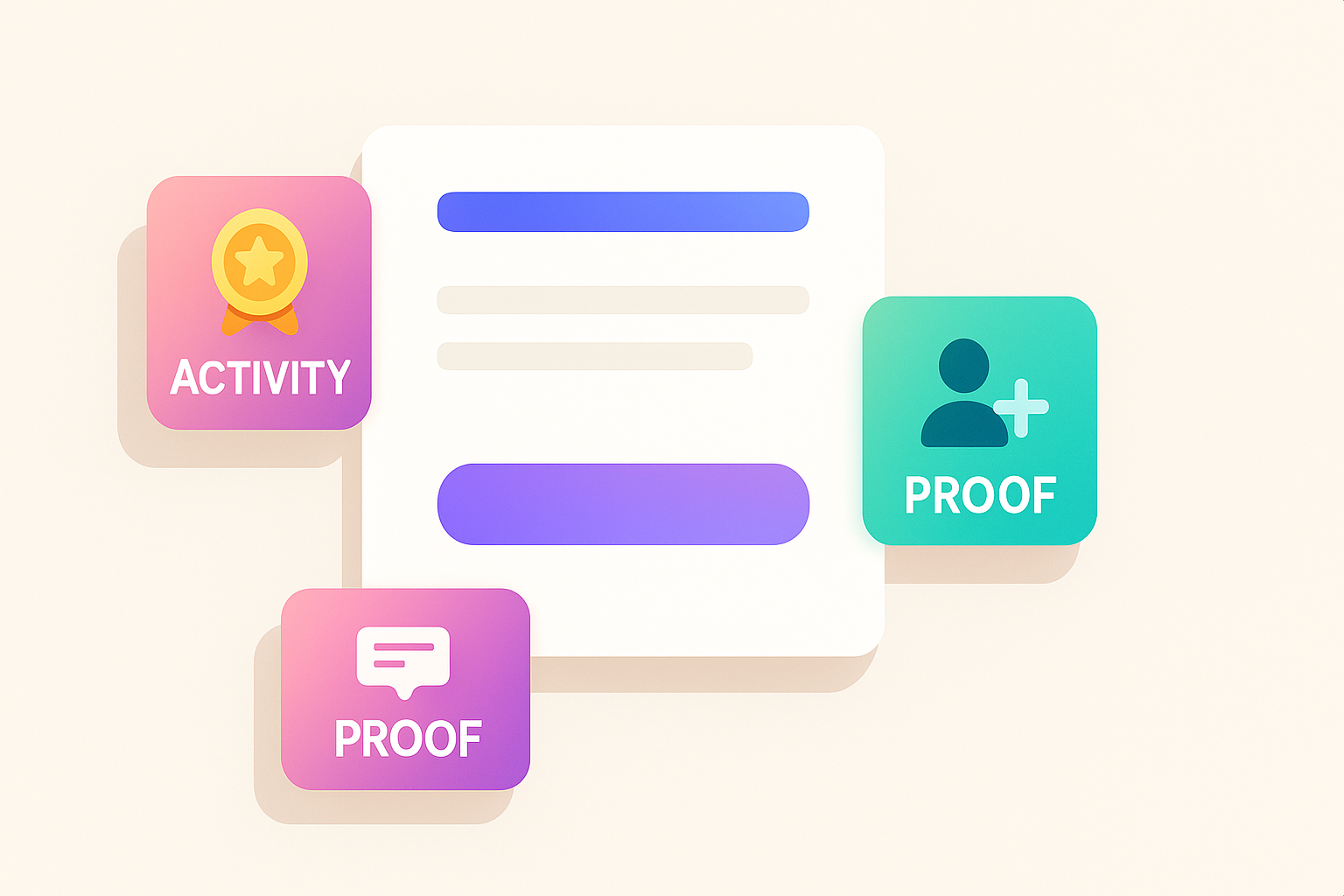
Activity (from your course/community): shows real milestones or badges earned. Example: “First Ad Live,” “Setup Complete,” “Lesson 1 Done.”
-
Proof (gentle joins/sales pings): small notices like “Someone just joined” or “New badge earned.” They imply motion without shouting.
Use both quietly. They are nudges, not the star of the page.
NOTE: This is a pre-release set of best practice guidelines for these types of widgets. More specific guidance and example will be provided when the features and functionality is formally announced.
Where to place them
-
Hero area: one small Proof ping near (not inside) the main button. It should not cover the button on mobile.
-
Benefits section: an Activity strip under your 3 bullets. Show 1–3 recent milestones with tiny icons.
-
Near testimonials: a single Proof ping is fine here. It frames the quote as current.
How often to show
-
Cadence: 30–90 seconds between pings, randomized.
-
Cap: show at most 3–5 pings per visit. Then rest.
-
Quiet rule: if there is no new activity, hide Proof. Don’t loop old messages.
Privacy + honesty
-
No full names. Use first name + initial or “Someone” if your data is limited.
-
No exact prices. Keep copy neutral: “joined,” “unlocked,” “earned a badge.”
-
Real events only. If you can’t verify it, don’t display it.
Copy you can paste (micro-lines)
-
Proof: “Someone just joined,” “A new member unlocked Lesson 1,” “Badge earned: First Ad Live.”
-
Activity list items: “3 owners finished the setup today,” “5 welcome emails sent,” “2 checklists downloaded.”
Page layout that works (simple map)
-
Hero: clear headline + one button. Tiny Proof ping anchored below the button.
-
Promise section: 3 bullets with a short Activity strip underneath (last 3 milestones).
-
What you get: outline of steps/modules. No widget here—let the details breathe.
-
Social row: 2–3 short testimonials + one Proof ping (optional).
-
CTA row: price, button, tiny trust line (“30-day help path” or similar).
Examples by offer type
Community newsletter
Activity: “Weekend Guide downloaded,” “New subscriber welcome sent,” “Event list updated.”
Proof: “Someone in River Park joined 6 min ago.”
Food newsletter
Activity: “2 hidden menu tips added,” “Photo gallery updated.”
Proof: “New member joined to get this week’s openings.”
Owner offer (checklist or sprint)
Activity: “3 owners finished Day 1,” “Badge: First Ad Live.”
Proof: “Someone unlocked the 7-day sprint.”
Setup checklist (start to finish)
-
Choose 3–5 real events you want to surface (badges, completions, downloads).
-
Turn on Activity and map each event name to a short label you can show on the page.
-
Enable Proof pings, pick the corner, and set the cadence (30–90s, cap at 5).
-
Mobile test: make sure pings don’t cover the CTA. On small screens, anchor them lower.
-
Quiet rule: if no fresh events, hide Proof for that visit.
What to watch
-
Primary button click-through: does it rise when Proof is on?
-
Form completion rate: more starts turning into signups?
-
Dismiss rate: if many visitors close pings, lower the cadence or move their position.
Common fixes
-
Too noisy? Increase the time between pings. Show fewer items in the Activity strip.
-
Feels stale? Refresh milestone names; rotate 1–2 new events each week.
-
Covers the button? Move Proof below the fold on mobile or shift it to the opposite corner.
TL;DR
-
Show real Activity (badges, completions) and gentle Proof pings.
-
Place them near the CTA and benefits, not over them.
-
Keep it quiet: random 30–90s cadence, max 5 pings, hide when no fresh activity.
-
Test on mobile. Track clicks and completions. Adjust weekly.
|

